Critique of 3 Frequently Visited Websites:
YouTube, WebMD & MSN
By Jo Anna Johnson
By Jo Anna Johnson

YouTube is a great repository for videos and information. You can find the latest music as well as the oldies-but-goodies. It is also a good place to find useful tutorials related to various topics, news, sports and current trends. Users can also upload videos for sharing.
On the down-side, YouTube runs a lot of ads that interupt the user experience.
The primary color used on the website is muted gray with white as a secondary color and red as the accent color.
The use for muted gray as the primary color along with white helps to make the website look clean and uncluttered inspite of its vast content. The red accent color pops on the page and provides a dramatic contrast that drives the eye to appropriate call to action areas. The mood and feeling of the colors work well with the purpose of the site.
YouTube has a wide array of users, young and old, from the moderately experienced user to techies and professionals.
The website's design caters to the various needs and experience levels of its users with its search and navigation features and click-and-play video functionality.
The users' tasks and goals by visiting YouTube are entertainment, information and media sharing.
Videos can be accessed and viewed quite easily. With some additional know-how, other goals and tasks related to media sharing can be accomplished. YouTube is an awesome hub for showcasing information.
YouTube, with its user-centered design, definitely succeeds in providing a good user experience (UX).
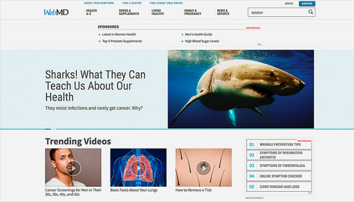
WebMD is a comprehensive resource for health and medical information. The search feature allows users to look up terms and symptoms to research potential health issues.
There is nothing particularly obtrusive or distracting about this website.
The primary color used for the website is white with light blue as the secondary color.
These colors project a mood and feeling of purity and cleanliness that match the purpose of the site.
Health-conscious adults are the primary users of the WebMD site.
The website's design caters to its user base with a database of searchable medical information, health and fitness related articles and doctor and prescription drug resources.
The users' tasks and goals by visiting the WebMD site are to research and learn about medical, health and fitness related topics.
This task and goal is expertly accomplished with this well-organized site. Clearly displayed navigation and search functionality makes desired information easy to find and access.
The WebMD site succeeds in providing a good user experience (UX) to people focused on health.
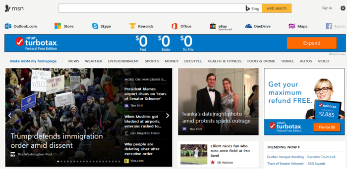
The MSN website is a great resource for news, current issues and relevant topics. This site is also a hub for several popular applications such as Outlook, Skype and Facebook.
The MSN website can, however, be a bit overwelming with its numberous sections, articles and content. The site verges on being too busy and lacks focus.
The primary color used on the website is light gray or white depending on the section.
These colors help to neutralize and give a feeling of space to the vast abundance of content on the website and is a good match for the purpose of the site.
People on the go and business professionals are the primary users of MSN.com
The website's design caters to that user base with its one-stop-shop functionality, featuring countless topics such as news, entertainment, sports, money, lifestyle and travel. Users can also access many of their communication tools such as email and social media.
The users' tasks and goals by visiting MSN.com is to stay informed and connected while on the go.
MSN.com does a great job of executing this task and helping its users obtain that goal. Although all the content may be a bit much to weed through, this website accomplishes its objective to be a super-source of news, relevant topics and a place to plug in.
MSN.com succeeds in providing a good user experience (UX) to people seeking news, information and communication access all in one place.